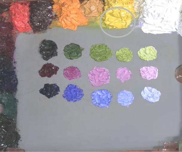
I get a lot of questions about how to set up a value line palette. Here's how: Years ago, I realized that while I was painting, I was setting up small value areas of color on my palette, so I decided to try mixing those ahead of time and came up with my value line palette. Since then, it has given me more freedom
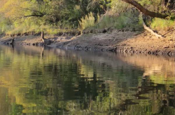
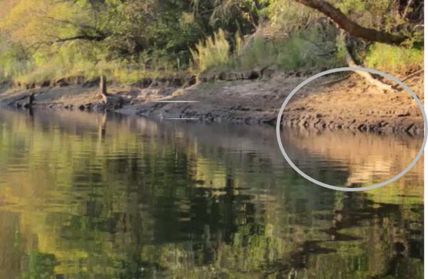
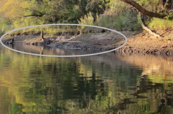
while mixing color than I could have ever predicted. Following is my process for setting a value line palette. I'll use this photo reference: Step 1: Identify the hue of the color you see in the largest amounts. In this reference, that hue is yellow green. There is a range of yellow greens from deep shadow to bright light. My yellow green
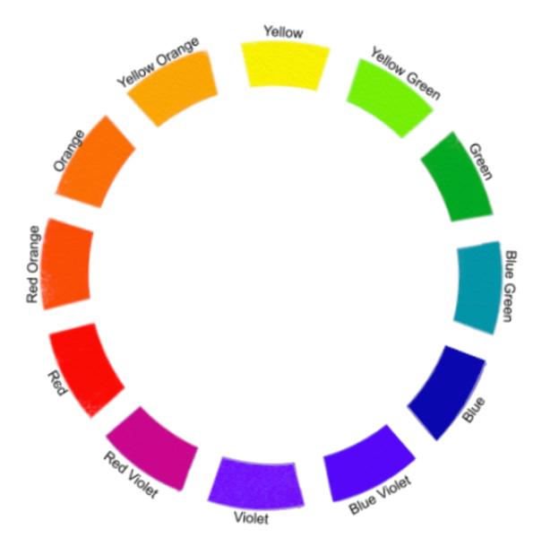
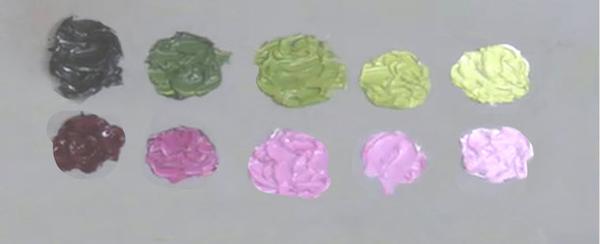
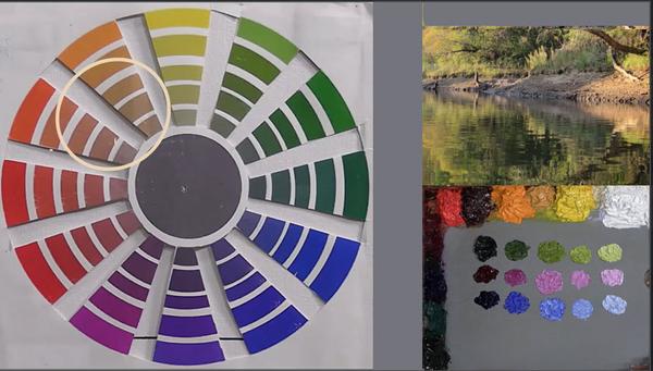
tube color of choice is sap green. I mixed five values of the hue yellow green in a horizontal line by first adding hansa yellow light to sap green for the middle value and the value between middle and darkest, then adding white to the middle value for the two lightest colors. Some areas of the yellow green are less saturated than other. That is always true with hues we see in our everyday world. Step 2: I need the ability to desaturate yellow green, so I refer to the color wheel and find red violet as its complement. My tube color quinacrodone violet is red violet, so I create another value line with it, adding white to get the lighter values. Step 3: I need the ability to cool the yellow green. Blue is the coolest hue on the color wheel, so I choose ultramarine blue because it is the darkest, most transparent, coolest blue. Then, using white, I create
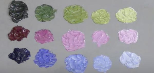
the blue value line. Step 4: The last thing I need potential to do to the yellow green is to warm it. Areas where the light is hitting brightest are a bit warmer than my lightest light of yellow green in that value line, so I add hansa yellow
light to the palette because it is my warmest hue. I don't need a value line for yellow because it won't be needed in the other value ranges. Step 5: I look back at the reference now to locate other colors I see in it. The next hue I spot is in an orange range, slightly leaning towards yellow orange and very desaturated. I look then at my palette to see if I have potential for
mixing those oranges. I check my color/intensity wheel and see that by adding a bit of yellow to the red violet, I can get those hues, especially if I desaturate with yellow green. So I don't need to add another color. Step 6: I check the reference again for other colors and see that large neutral area that leans towards blue violet. I look back at my palette and see that red violet added to blue will create blue violet, and that hue will desaturate with
yellow green. As will often happens when using this method, I don't need any more colors to express the colors I see in this scene. The miracle of this approach to choosing colors for the palette is that most often the process for potential with the first color will produce
all the colors we need. At most, for other subjects, only one other color will be needed. Here's the sequence in summary: 1. Choose first color 2. Create its full value range 3. Choose a way to desaturate it 4. Choose a way to cool it 5: Choose a way to warm it. 6. Check to see the potential is now on the palette for creating the other colors you
see. Enjoy a weekend of finding potential in color!
|
Happy Painting,
Dianne
dianne@diannemize.com
|
BELOW ARE LINKS TO THE MYSTERY OF PAINTING SERIES: Light and Shadow: The one thing that lets our eyes see.
Visual Movement: What our eyes do when images are visible.
Seeing Beyond the Image: The possibilities beyond just describing what our eyes see.
Freeing the Artist Within
(Curiosity): Finding our individual interpretation to what our eyes are seeing.
Composing: Finding ways to put together all that we discover.
Drawing: Searching the potential of images.
The Craft: Continually forging our skills to visually communicate what we continue to discover with our eyes, mind and soul. And the eighth: The Art: The results when all the above are working together. You can
access the archive of all my newsletters at anytime by going HERE. |