I'm pausing my series on visual paths to address an area of our paintings that too often gets inadequate consideration: negative space. Yet, without negative space, we can't really create a painting. And what we do with it will determine how effective are our visual paths. So, here is a good place in our series to think about negative
space. Too often while we are painting, we get so focused on the images themselves that we forget how their surroundings influence how the viewer sees these images. Even the term "background" suggests a secondary importance. What if we make a habit of using the term "negative space" instead. Would that cause us to give those areas more attention? Especially, if we realize that
negative space is as important as positive space. Negative space is that space in a painting that surrounds images. The images themselves
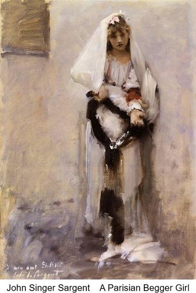
are referred to as positive space. Those designations recognize that we are composing in two-dimensional visual space. John Singer Sargent was a master of working negative space.
Let's look at how what he did with it in his painting, A Parisian Begger Girl. Although the negative space (what is called background) is simple, it has a gradation in value from the lower part to the upper part, and it has that little window on the upper left that gives us clues about the
environment around the girl. When we take that window away, we still have some attention given to the negative space, but we don't have any idea about the environment. That value gradation and the subtle
hue variations give us the interpretation that this is a portrait of the girl, and that works very well. But it doesn't give us that extra information Sargent wanted to give. See the difference, if we take away the window? But when we give no consideration to that negative space other than giving a harmonizing color to the negative area, we have a stark image of the girl within a flat background. I'm not trying to say that one is better than the other. But what's important to remember is that how we handle that negative space is as important to the image as the parts of the image are in defining it. Take a look at Kevin MacPherson's portrait paintings and notice how his negative spaces contribute to the interpretion of the image. Now, go to MacPherson's painting of a boat. Notice what he's done in the negative space that influences our interpretation of the boat. NOT THAT YOU KNOW WHAT TO LOOK FOR... ... look at your own work and check what your negative space is doing. Enjoy a weekend of discovery! During my Language of Painting series, I explained the role of our visual elements. If you'd like to review those roles to better understand the behavior of elements, here are the links to each of those
discussions: Color --Value -- Shape -- Texture -- Size -- Line and Direction
You can access the archive of all my newsletters (as well as the Quick Tips and other stuff) at any time by going HERE.
|