Take away the fashions of the era. Subtract out the staging and posed stiffness of his portraits and turn your attention to the vibrancy of color alone. There you will find a mastery that makes today's painters drool over works
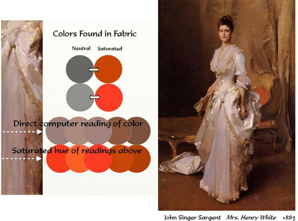
by John Singer Sargent. Prowling through nearly 2000 Sargent paintings, we discover one thing most of them have in common--the juxtaposition of cool and warm. Let's examine one of
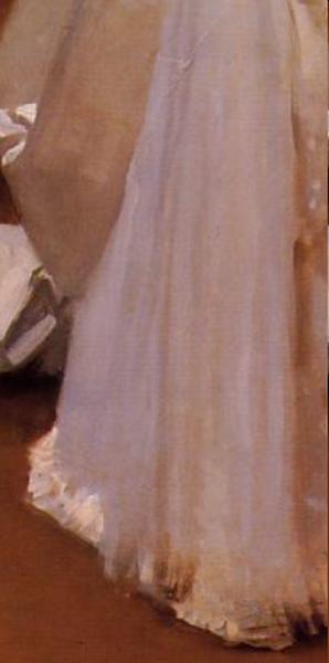
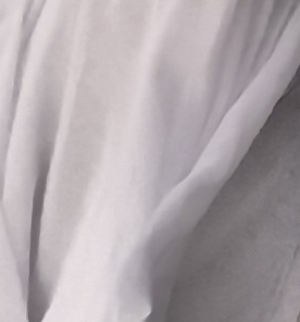
those. By moving throughout the painting and looking for the hues we see, we can determine Sargent's color scheme. I did some computer samples to drive home the point. Let's focus on the fabric of the woman's
dress. Notice as your
eye moves side to side across the fabric most in light, each vertical area of color is slightly warmer or cooler than the one beside it. These alternations are in the similar value range. When we analyze the actual hues in those areas, we discover they are actually slight variations of a neutral version of orange and red orange to blue violet, ranging in values as they move side to side from halftone to shadow. Even though Sargent was a master as working warm/cool, any painter can learn to do it. You'll need cadmium red light, cadmium yellow, ultramarine blue and white, and the photo below. Now, using the photo as your reference, do a study where you practice Sargent's color progression technique used in the dress--cool/warm/cool/warm-- to render the folds. Here are some clues to work with: ► Begin by mixing cadmium red light into ultramarine blue until you get as close to a neutral as possible. It will lean a bit towards violet. ► Create the lighter values you need by adding white ► Once you find the value, then adding a bit of cadmium red light to that mixture for the "pinkish" colors you see. ► To the "pinkish" mixtures, a bit of yellow will warm it towards orange. ► Alternating the cools and warms in similar values will give your study a vibrancy. Doing this exercise, you will have unlocked one of Sargent's most
often used methods of making color sing. You will have discovered for yourself one of Sargent's color secrets. Enjoy a fun weekend discovery! During my Language of Painting series, I explained the role of our visual elements. If you'd like to review those roles to better understand the behavior of elements, here are the links to each of those
discussions: Color --Value -- Shape -- Texture -- Size -- Line and Direction
You can access the archive of all my newsletters (as well as the Quick Tips and other stuff) at any time by going HERE.
|