• I hope you can join us tomorrow, June 26, for our monthly YouTube live chat at 2 p.m. Eastern.
|
Our traditional color wheel is a tool that contains potential for helping us build any color we see--when we learn how to read it. Many companies who publish a wheel add computing
guides in it center, but from my viewpoint, these are too limiting. Anything that requires rules to remember can be restricting in your painting process. But when you learn how things work, like any skill, you gather for yourself an open-ended path to finding whatever you need.
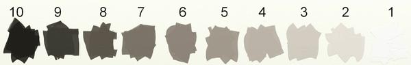
The color wheel doesn't tell you anything about values. Even though you might notice the values of hues on various wheels, some color's values might be different from wheel to wheel. There is no way to show a
color without it having a value, so this happens by default. Our values scales help us read value, not our color wheels.
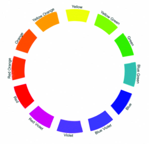
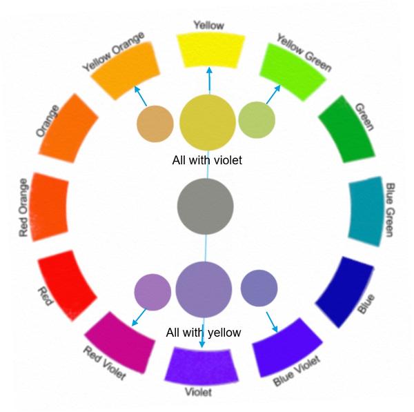
The color wheel does tell us whatever we need to know about hue. It is easier to read when we learn to call all colors by their original primary/secondary/tertiary hue names--yellow, yellow-orange, orange, red orange, red, red violet, violet, blue violet, blue, blue green, green, yellow green. It can be confusing using the wheel if we use labels like magenta (which is red violet), cyan (which is greenish blue), and olive (which is low intensity yellow green). Also, color names like yellow ochre,
burnt sienna, viridian, cadmium red, etc, are not hue names, but pigment and/or tube names, so they are not helpful when reading the wheel neither.
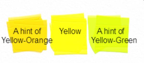
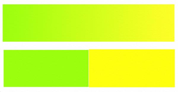
Any individual hue can lean towards either of its neighboring hues and still be perceived as itself. For example, the hue yellow can still appear as yellow when it contains either a hint of yellow orange or a hit of yellow green.
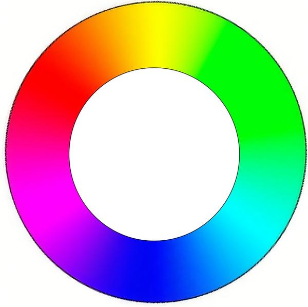
Any hue lives somewhere in a continuum between its neighboring hues. Master painters train themselves to recognize where on that continuum a hue lives. We can use the color
wheel to help narrow that down.
Where in this example does yellow green and yellow begin?
• Intensity (also called Saturation or Chroma)
The wheel will also show us how to read and create a hue's intensity. The traditional wheel arranges the hues so that opposite hues live directly opposite each other within the weel. Those hues
neutralize each other in every possible degree of neutralization, even to the point that all hue of both colors vanishes. In addition, any other hue containing either of those opposing hues will play the neutralizing role to a degree.
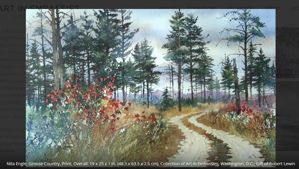
No single color exists as hue only. Rather every color is made of wherever its hue falls within the wheel, the degree of saturation of that hue, and the
value of that hue.
Can you isolate, one at a time, any area of this Nita Ingle painting, then match that color using the color wheel and value scale as your guide? What hue is it? What value is it? What saturation is
it?
Enjoy a weekend of discovering the color wheel!
During my Language of Painting series, I explained the role of our visual elements. If you'd like to review those roles to better understand the behavior of elements, here are the links to each of those
discussions: Color --Value -- Shape -- Texture -- Size -- Line and Direction
You can access the archive of all my newsletters (as well as the Quick Tips and other stuff) at any time by going HERE.
|
|
|
|