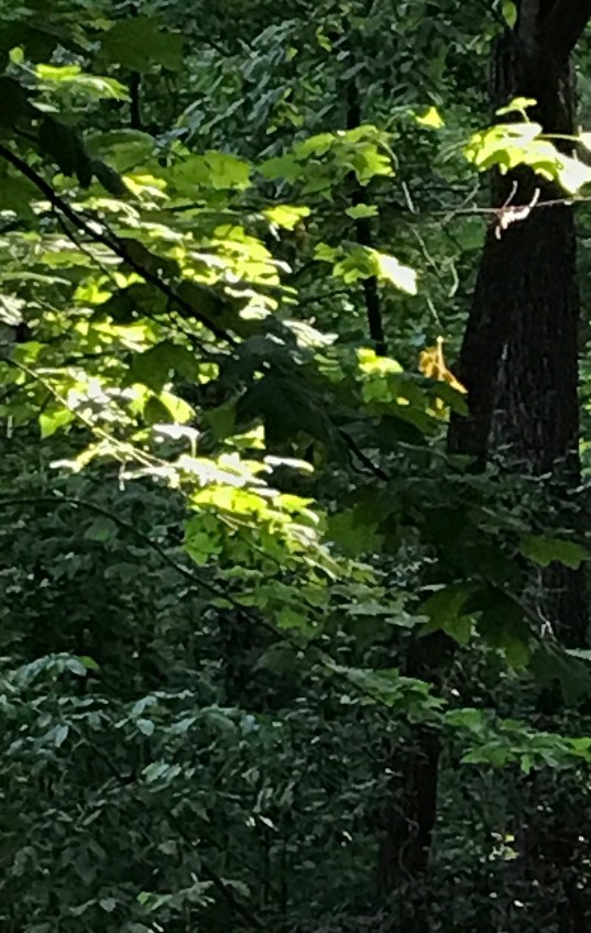
It's 8 a.m. I'm looking out my window facing northeast. The sun is behind my woods, but there is a gap between the woods and a maple in my yard. That maple's protruding limbs are the direct rays of
the sun from the backside. What I'm seeing is the translucent light through the leaves. What values am I seeing and what are they doing?
(The camera caught only about 70 percent of what I am seeing.)
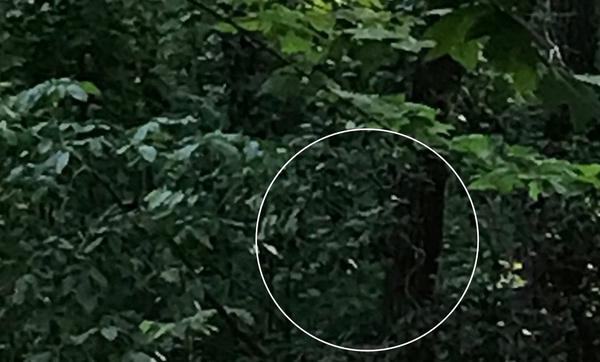
The woods are in shadow. The tree trunks and larger limbs contain values 10 & 9, the foliage behind and surrounding are in alternations of 8, 7 and
6
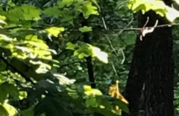
The leaves lit most strongly from behind are gradations of 1 to 2 to 3. Where they are in lower light, they are in ranges of values 4 and 5.
(The camera overexposed the shadow areas behind the lit leaves. I don't see that area at the same value the camera has
registered.)
Each of these value differences is a kind of value contrast. Value contrast does not mean only strong lights against strong darks. Rather, it refers to any kind of
difference in value. It is our ability to read and translate those differences, then use them wisely in our painting that can transform the quality of our work.
We can learn this best by studying what we see, not by setting rules.
- Imagine value 10, then paint a swatch of it.
- Imagine value 1, then about an inch from your value 10 swatch, paint a swatch of it.
- Imagine values 5 and 6. Place swatches of them side by side in between 1 and 10.
- You have just created a close (minor) value contrast between 5 and 4, and a moderate contrast between 6 & 10 and 5 & 1.
- You have imagined and translated 4 values and you have created a value relationship.
Now, look find in your environs those values you have created.
Enjoy a delightful weekend!
You can access the archive of all my newsletters at anytime by going HERE. |