Probably we are more familiar with gradation than any other principle of composition. Simply put, gradation is a continuous transition between two opposites.
Light changes progressively to dark, large becomes small, one color unfolds into another. . .these are all examples of gradation. But really, any visual element—whether it be size, shape, direction, edges, value, hue, intensity, temperature or texture—can be gradated just as they can be
contrasted.
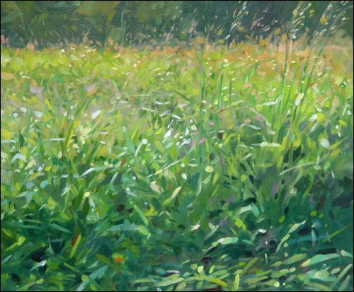
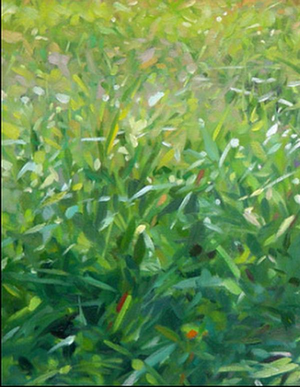
Take a look at how Colin Page gradates a number of these elements in his painting, Growing Tall.
There’s a lot of activity here. . . titillating flecks of light, rapid directional contrasts, quick gestures, and so on—but if you squint your eyes at Colin’s painting and concentrate on the
darks and lights, you’ll discover an underlying gradation in value.
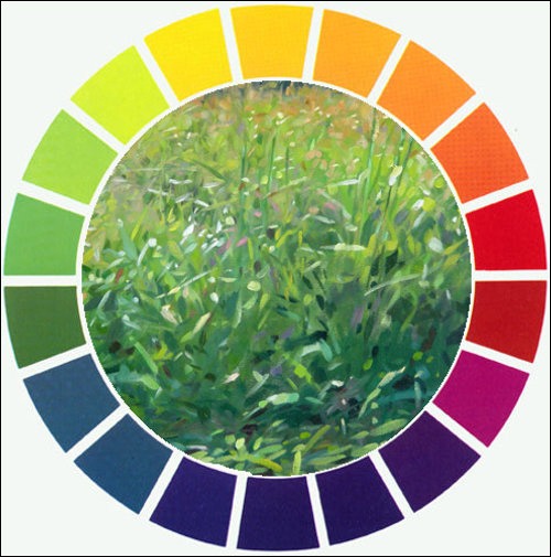
Then look at the hues and name them to yourself as they appear, from the bottom to the top—blue-green, green, yellow green,
yellow, orange—they all transition in the same order as the colors on the color wheel.
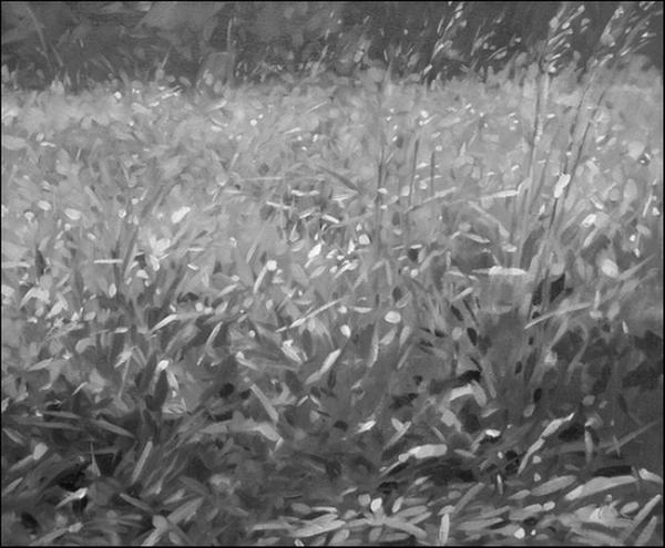
Let's break it down a bit more. In this excerpt observe how the size of the strokes for grass blades progressively get smaller from bottom to top of the painting.
Now that I've got your started, examine-one at a time-
gradation of shape (precise to obscure)
edges (crisp to soft)
temperature (cool to warm)
texture (bold to smoother)
Colin has gradated the majority of our visual elements.
As you can see, creative possibilities abound for using gradation in a painting. Try some of these ideas in your own work and discover that an exciting, intriguing, and more unified painting will most likely result. You can access the archive of all my newsletters at anytime by going HERE. |
|
|
|